Tesla firmware 8.0 has been out for several weeks now but I wanted to hold off on a review -in specific, a review on the updated Navigation feature – until I had completed several trips using it. And now with several hundred miles logged using Tesla Navigation, I’ll offer up my opinion of it.
The summary is that, while noft quite as bad as the new Media Player, there are some glaring bugs in the basic functionality of 8.0 Navigation that get in the way of otherwise great improvements.
The Good
While controversial, the expanded map view (thanks to the auto-hiding menu bar) is a welcome addition that maximizes the use of the beautiful 17″ touchscreen.
Some owners have complained that it requires an extra press to get to other functions (charts, browser, phone app, etc) now, but for my daily use, I rarely change out of the two selected features displayed on my 17″ screen (Navigation and Media).
Another thing I really like is that Tesla preserved the current location information (street, city, state) while hiding the menu bar. It would have been a big loss if they had taken the easy path and removed it with the rest.
Another controversial change is Tesla’s decision to pin the Navigation screen to the top of the 17″ display by default. In the past, picking a new app put it on top by default, but now if Navigation is being shown, then picking another app will place it below the Navigation window. Some people, like myself, appreciate this new behavior, but others are frustrated by it and would like the old behavior back. A simple option in the user preferences would solve this but I also understand the drawbacks with adding too many options to an user interface.
Tesla has 4 view modes for the map:
- North up
- Heading up
- Trip overview
- Leg overview
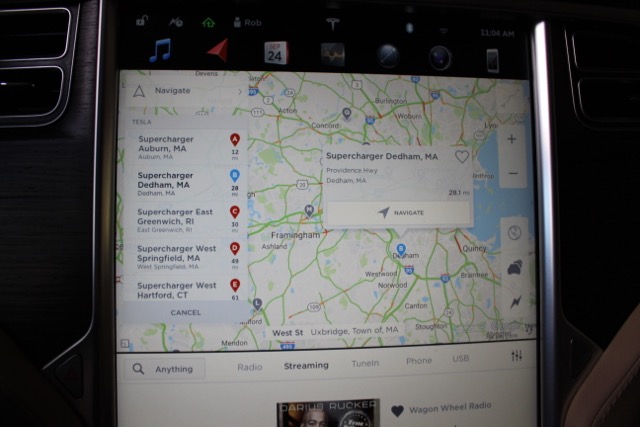
Tesla added a new improvement to the map by displaying an indicator to the side of the road your destination resides on. Another nice feature is a new shortcut menu that helps you locate the closest chargers for your current location. While similar to the functionality provided by EVTripping’s Chargers page, although in a more graphical form, it still lacks the ability to bring up charger amenities and details with a quick tap.
Full disclosure: I’m the creator of EVtripping.com but would love to see Tesla incorporate some of our app features into its software.
The Bad
This is a great overview of your trip which highlights the number of required charges. What is different in this version is that after you start driving there doesn’t appear to be a way to get back to this trip overview. That’s a loss they should fix.
The way the system reports on round trip remaining charge still has me confused. I was trained to tap the bottom of the directions and quickly get my round trip range. Now I find myself awkwardly scrolling to the bottom of a list while driving to find it. And that’s if I’ve turned it on. Any list that requires scrolling used while driving should be eliminated as it can be a major distraction.
The Ugly
The Navigation system seems much slower to update now. Recently, while cruising in Boston, I literally had to stop at a light, after taking a wrong turn, just to wait for the map to update. Having done similar drives before and knowing the speed of map refresh, I believe performance has degraded which causes the basic Navigation functionality to be less useful.
The worst and most glaring issue, in my opinion, involves the maps inability to properly discern tunnels. The system gets confused by tunnels and will show that you’re within one when in fact you’re not. It has been so bad that at times I’ve had to reboot the dashboard display.
8.0 Navigation Summary
Like the media player updates, I believe the improvements are a good step forward in many areas in terms of the user experience. The issues that I’ve run into need to be addressed in an upcoming patch or the 8.1 release.
Tesla’s Navigation system still lacks many of the features that other car manufacturers have had for almost a decade. Waypoints, alternative routes, route preferences, etc. Even some small usability issues, like the random sorting of favorites in the Navigation system, have not yet been addressed.
While I appreciate the upgraded user interface design, I can’t help but wonder about how Tesla determines the priority list for firmware feature updates. Are they focusing on features that target everyday driving or are they prioritizing feature sets based on user demand?