Investor's Corner
Trending $TSLA: Remove the “noise”
Last week I introduced the MACD indicator. This week I will present a different way of displaying stock charts that works well with the MACD to help in forecasting future stock behavior.
Most profits and losses are generated when markets are trending. Market “noise” is simply all of the price data that distorts the picture of the underlying trend. This includes mostly small corrections and intraday volatility. Noise removal is one of the most important aspects of active trading. By employing noise-removal techniques, traders can avoid false signals and get a clearer picture of an overall trend.
The Heikin Ashi technique (“average bar” in Japanese) is one of many techniques used to remove noise and improve the isolation of trends to predict future prices.
Heikin Ashi charts are a type of candlestick chart that shares many characteristics with standard candlestick charts, but differs because of the values used to create each bar. I will not bore you with the formulas used to calculate the candlestick components (close, open, high, low). The Heikin Ashi formula factors in the current bar with an average of past bars in order to create a smoother trend. This process creates smoother price patterns that are much easier to read.
Daily Heikin Ashi charts are used to display “pay-day cycles” that display the daily trends, without the “noise.”
Take a look at the difference between the standard candlestick and the Heikin Ashi charts of TSLA stock for the past 5 months. First let’s take a look at the standard candlestick chart.
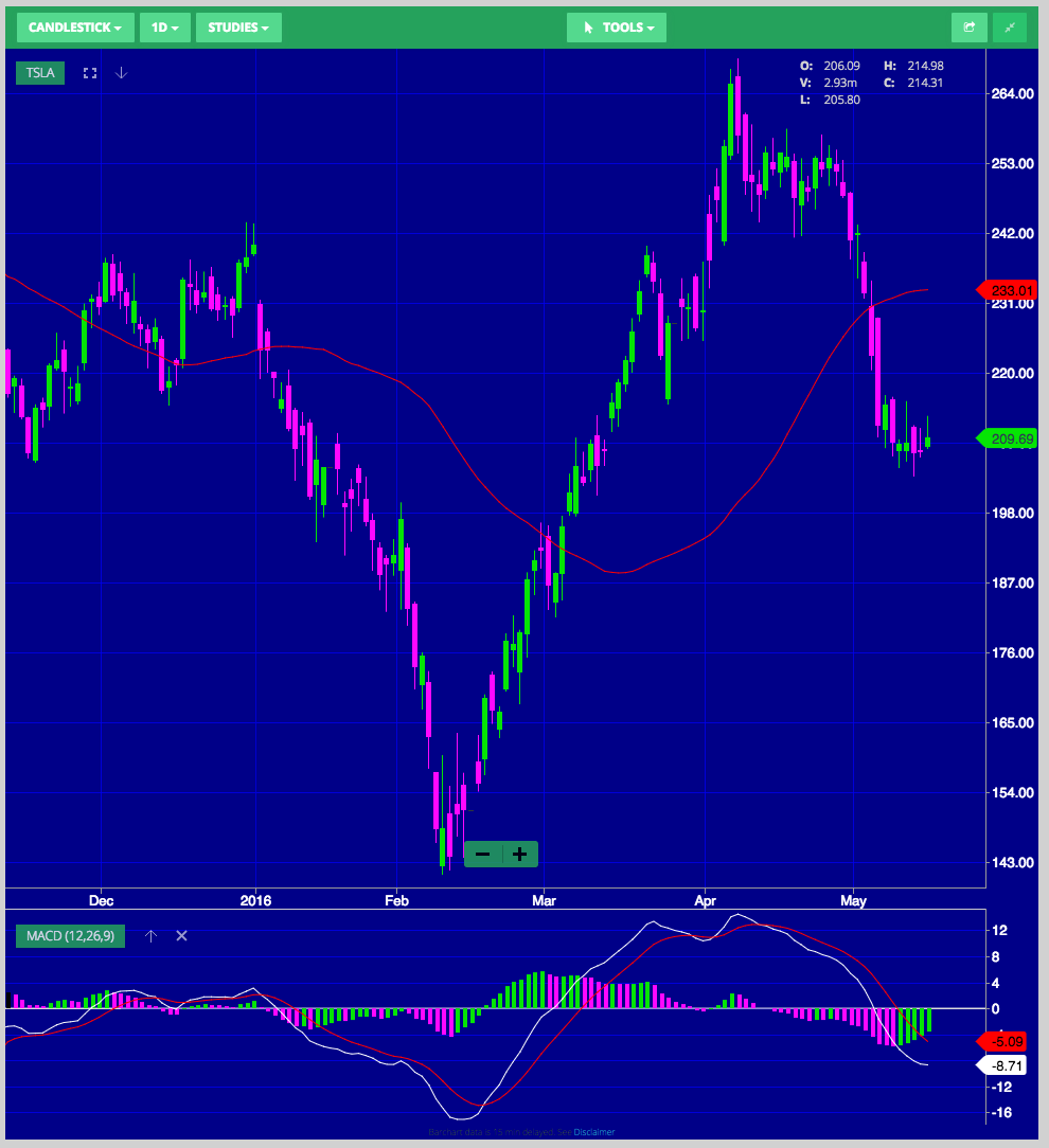
Candlestick Chart (Source: Wall Street I/O)
Now let’s take a look at the Heikin Ashi chart.
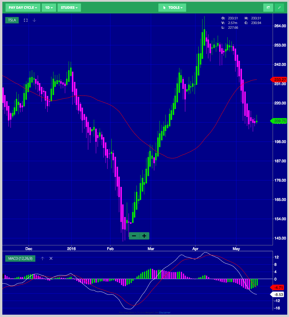
Heikin Ashi Chart (Source: Wall Street I/O)
Notice that in the latter chart the Jan.-Feb. and the May downtrends are more clearly visible, as well as the Feb-March huge uptrend gain.
In my trading I combine pay-day-cycles with the MACD. I make sure that the pay-day-cycle has turned positive (colored green in the chart above), and then I wait for the MACD to cross to the bulls to initiate a probing bullish trade.
Taking a look at today’s situation, this may be the first day of a green Heikin Ashi bar after 12 red bars. I also notice that the MACD is starting to flatten. We may be starting to form a bottom, and this could be the beginning of a potential reversal in the downtrend in TSLA stock, so I will be watching closely for an entry point when both indicators turn positive. Notice that in general the pay-day-cycle turns positive before the MACD does.
Heikin Ashi charts are now provided by most trading platforms: Wallst.io (select Chart Type – Pay Day Cycle), TD Ameritrade’s Thinkorswim (select Style – Chart Type – Heikin Ashi, Daily), OptionHouse (select Style: Heikin Ashi, Range: 6 Months, Frequency: 1 Day).
Also StockCharts.com offers free Heikin Ashi charts (enter TSLA, Chart Attributes, Type Heikin-Ashi, Update).
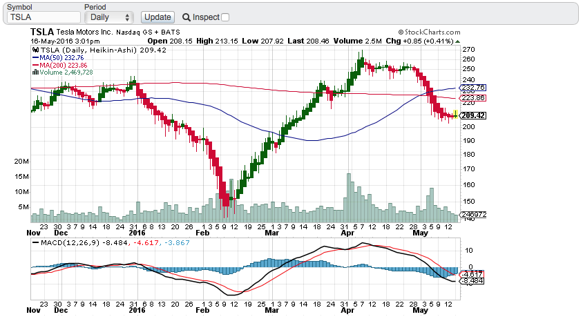
Source: StockChart.com
One interesting pattern that formed at the closed today is a “Doji”: a Doji candlestick looks like a cross, inverted cross or plus sign, and forms where a security’s open and close of the day are virtually equal. This often can be the precursor of a reversal. Secondly, the recent 50-day MA (Moving Average) move above the 200-day MA occurred a couple of weeks ago (see the chart above), again another usual precursor of a forthcoming bullish trend. And lastly, TSLA has support at the 206 level, from last November 2015. All of these are reasons to be bullish on TSLA, especially for short-term swing traders.
Is $TSLA going to reverse and move back up or will it start to compress, i.e. go sideways like it did in April? What do you guys think?


Elon Musk
Tesla investors will be shocked by Jim Cramer’s latest assessment
Jim Cramer is now speaking positively about Tesla, especially in terms of its Robotaxi performance and its perception as a company.
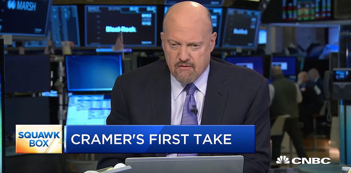
Tesla investors will be shocked by analyst Jim Cramer’s latest assessment of the company.
When it comes to Tesla analysts, many of them are consistent. The bulls usually stay the bulls, and the bears usually stay the bears. The notable analysts on each side are Dan Ives and Adam Jonas for the bulls, and Gordon Johnson for the bears.
Jim Cramer is one analyst who does not necessarily fit this mold. Cramer, who hosts CNBC’s Mad Money, has switched his opinion on Tesla stock (NASDAQ: TSLA) many times.
He has been bullish, like he was when he said the stock was a “sleeping giant” two years ago, and he has been bearish, like he was when he said there was “nothing magnificent” about the company just a few months ago.
Now, he is back to being a bull.
Cramer’s comments were related to two key points: how NVIDIA CEO Jensen Huang describes Tesla after working closely with the Company through their transactions, and how it is not a car company, as well as the recent launch of the Robotaxi fleet.
Jensen Huang’s Tesla Narrative
Cramer says that the narrative on quarterly and annual deliveries is overblown, and those who continue to worry about Tesla’s performance on that metric are misled.
“It’s not a car company,” he said.
He went on to say that people like Huang speak highly of Tesla, and that should be enough to deter any true skepticism:
“I believe what Musk says cause Musk is working with Jensen and Jensen’s telling me what’s happening on the other side is pretty amazing.”
Tesla self-driving development gets huge compliment from NVIDIA CEO
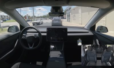
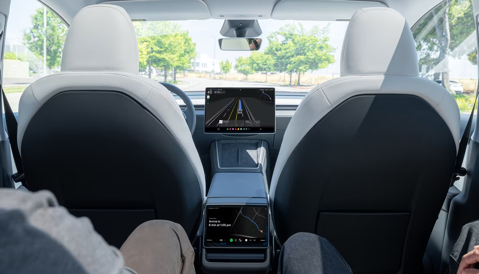
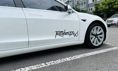
Robotaxi Launch
Many media outlets are being extremely negative regarding the early rollout of Tesla’s Robotaxi platform in Austin, Texas.
There have been a handful of small issues, but nothing significant. Cramer says that humans make mistakes in vehicles too, yet, when Tesla’s test phase of the Robotaxi does it, it’s front page news and needs to be magnified.
He said:
“Look, I mean, drivers make mistakes all the time. Why should we hold Tesla to a standard where there can be no mistakes?”
It’s refreshing to hear Cramer speak logically about the Robotaxi fleet, as Tesla has taken every measure to ensure there are no mishaps. There are safety monitors in the passenger seat, and the area of travel is limited, confined to a small number of people.
Tesla is still improving and hopes to remove teleoperators and safety monitors slowly, as CEO Elon Musk said more freedom could be granted within one or two months.
Investor's Corner
Tesla gets $475 price target from Benchmark amid initial Robotaxi rollout
Tesla’s limited rollout of its Robotaxi service in Austin is already catching the eye of Wall Street.
Venture capital firm Benchmark recently reiterated its “Buy” rating and raised its price target on Tesla stock (NASDAQ: TSLA) from $350 to $475 per share, citing the company’s initial Robotaxi service deployment as a sign of future growth potential.
Benchmark analyst Mickey Legg praised the Robotaxi service pilot’s “controlled and safety-first approach,” adding that it could help Tesla earn the trust of regulators and the general public.
Confidence in camera-based autonomy
Legg reiterated Benchmark’s belief in Tesla’s vision-only approach to autonomous driving. “We are a believer in Tesla’s camera-focused approach that is not only cost effective but also scalable,” he noted.
The analyst contrasted Tesla’s simple setup with the more expensive hardware stacks used by competitors like Waymo, which use various sophisticated sensors that hike up costs, as noted in an Investing.com report. Compared to Tesla’s Model Y Robotaxis, Waymo’s self-driving cars are significantly more expensive.
He also pointed to upcoming Texas regulations set to take effect in September, suggesting they could help create a regulatory framework favorable to autonomous services in other cities.
“New regulations for autonomous vehicles are set to go into place on Sept. 1 in TX that we believe will further help win trust and pave the way for expansion to additional cities,” the analyst wrote.
Tesla as a robotics powerhouse
Beyond robotaxis, Legg sees Tesla evolving beyond its roots as an electric vehicle maker. He noted that Tesla’s humanoid robot, Optimus, could be a long-term growth driver alongside new vehicle programs and other future initiatives.
“In our view, the company is undergoing an evolution from a trailblazing vehicle OEM to a high-tech automation and robotics company with unmatched domestic manufacturing scale,” he wrote.
Benchmark noted that Tesla stock had rebounded over 50% from its April lows, driven in part by easing tariff concerns and growing momentum around autonomy. With its initial Robotaxi rollout now underway, the firm has returned to its previous $475 per share target and reaffirmed TSLA as a Benchmark Top Pick for 2025.
Elon Musk
Tesla blacklisted by Swedish pension fund AP7 as it sells entire stake
A Swedish pension fund is offloading its Tesla holdings for good.
Tesla shares have been blacklisted by the Swedish pension fund AP7, who said earlier today that it has “verified violations of labor rights in the United States” by the automaker.
The fund ended up selling its entire stake, which was worth around $1.36 billion when it liquidated its holdings in late May. Reuters first reported on AP7’s move.
Other pension and retirement funds have relinquished some of their Tesla holdings due to CEO Elon Musk’s involvement in politics, among other reasons, and although the company’s stock has been a great contributor to growth for many funds over the past decade, these managers are not willing to see past the CEO’s right to free speech.
However, AP7 says the move is related not to Musk’s involvement in government nor his political stances. Instead, the fund said it verified several labor rights violations in the U.S.:
“AP7 has decided to blacklist Tesla due to verified violations of labor rights in the United States. Despite several years of dialogue with Tesla, including shareholder proposals in collaboration with other investors, the company has not taken sufficient measures to address the issues.”
Tesla made up about 1 percent of the AP7 Equity Fund, according to a spokesperson. This equated to roughly 13 billion crowns, but the fund’s total assets were about 1,181 billion crowns at the end of May when the Tesla stake was sold off.
Tesla has had its share of labor lawsuits over the past few years, just as any large company deals with at some point or another. There have been claims of restrictions against labor union supporters, including one that Tesla was favored by judges, as they did not want pro-union clothing in the factory. Tesla argued that loose-fitting clothing presented a safety hazard, and the courts agreed.
(Photo: Tesla)
There have also been claims of racism at the Fremont Factory by a former elevator contractor named Owen Diaz. He was awarded a substantial sum of $137m. However, U.S. District Judge William Orrick ruled the $137 million award was excessive, reducing it to $15 million. Diaz rejected this sum.
Another jury awarded Diaz $3.2 million. Diaz’s legal team said this payout was inadequate. He and Tesla ultimately settled for an undisclosed amount.
AP7 did not list any of the current labor violations that it cited as its reason for

Tesla investors will be shocked by Jim Cramer’s latest assessment

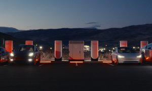
Tesla launches ultra-fast V4 Superchargers in China for the first time

Elon Musk hints at when Tesla could reduce Safety Monitors from Robotaxi


-

 News5 days ago
Tesla Robotaxi’s biggest challenge seems to be this one thing
-
 News2 weeks ago
Tesla confirms massive hardware change for autonomy improvement
-
 Elon Musk2 weeks ago
Elon Musk slams Bloomberg’s shocking xAI cash burn claims
-
 News2 weeks ago
Tesla China roars back with highest vehicle registrations this Q2 so far
-
 News2 weeks ago
Tesla features used to flunk 16-year-old’s driver license test
-
 News2 weeks ago
Texas lawmakers urge Tesla to delay Austin robotaxi launch to September
-
 News2 weeks ago
Tesla dominates Cars.com’s Made in America Index with clean sweep
-

 News2 weeks ago
Tesla’s Grok integration will be more realistic with this cool feature