Reviews
Reviewing the Tesla Model S Navigation System
I was hoping that Tesla firmware 6.0 would be out by now, especially having heard Elon promise that it would be “out soon”, but having seen 5.9, 5.10, 5.11 roll out over the last months, it’s safe to say that I may be living with the current Tesla navigation system for a bit longer.
In this post we’ll cover the navigation display and how to use it, but we’ll perform a deeper review on the navigation system in a follow up post.
Google Maps Display
 Google Maps powers the Tesla Model S Navigation system which appears on the 17″ touchscreen in either half screen (huge!) or full screen mode (mind blowing!).
In half-screen mode you can place the map on either the top or the bottom pane of the display. I prefer to have the map on the top as it’s closest to the windshield and my line of sight. I don’t find the map distracting and for me the viewing height in this position is very reasonable.
The map shown is a Tesla-modified and co-branded version of Google Maps. As you’d expect you can zoom in or out by pinching/reverse pinching or with the +/- icons. You can also drag to move the map, twist to rotate and interact with it the same way you would using your traditional smartphone or tablet.
Like Google Maps, the Tesla version offers both satellite and regular map views. Press on the globe icon and you get a satellite view. This is really cool for exploring areas or understanding your terrain better. The maps are a little more sluggish to load in satellite view but it’s only painful when you’re moving quickly on the map. One trick is to set the map in north up mode when in satellite view to reduce the number of screen refreshes which helps improve performance.
When in heading up view an extra compass icon appears on the map indicating which way is north. You can also tap that icon to switch back and forth between heading up and north up views.
There’s the ability to show traffic along your route by clicking the stop light icon. The map will be overlaid in green, yellow and red (and solid and dashed) lines indicating the severity of traffic.
 At the top of the display are a number of controls:
- A button to take you to saved/special places
- A search box to find new places
- A button to bring your back to your current position or switch between heading up or north up modes of display
- And a flag icon to show you your destination information.
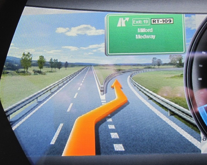
For those that have the Technology Package (about 85% of owners), a popup navigation with turn-by-turn directions appears on the upper top left of the map. This popup can’t be hidden, but the directions that are shown within it are scrollable — just drag your finger up and down on the directions and you’ll see all your turns.
At the bottom of the box is the remaining distance, current time and estimated time of arrival (ETA) to your destination. These numbers do not take into account traffic so you’re left to do the revised estimation on your own.
Navigon Display
 The Tesla Model S Navigation System comes with the technology package along with the the turn by turn directions and voice guidance. The technology package brings in a second navigation component, a version of Navigon by Garmin licensed by Tesla, that can produce directions and maps even when there is no network connectivity.
When you have a destination punched in, a second display becomes active automatically on your dash served by the Navigon component. This is a small section of a map that shows your route with turn by turn guidance. There’s absolutely no control over this display and no user preferences related to this display. You can’t zoom in or out and you can’t even stop it from popping up on your dash. Once the display is up (always on the left side of your dash), you can switch away from it to another display (like Media) but next time you start navigating somewhere it will pop back up again.
This second display is pretty quirky. At times the graphics, fonts and other items can look dated or poorly done, and at other times you’ll see graphics that don’t make a lot of sense or look as if they were incomplete. That said, I generally use the 17″ screen more for my turn information than the dashboard one. Fortunately the two guidance systems have both provided identical results — it would be a real mess if they gave different recommendations.
One thing I really like on the Navigon display is the way they do exits. They make an exit sign that is pretty darn close to what you’ll see in real life.

They even have different pictures for day vs night. If you look closely at any of these special exit displays you’ll notice that the image is actually an overlay on top of the navigation map (to the left of the speedo). This seems unfinished to me but it’s a minor nit.pick.
Display Summary
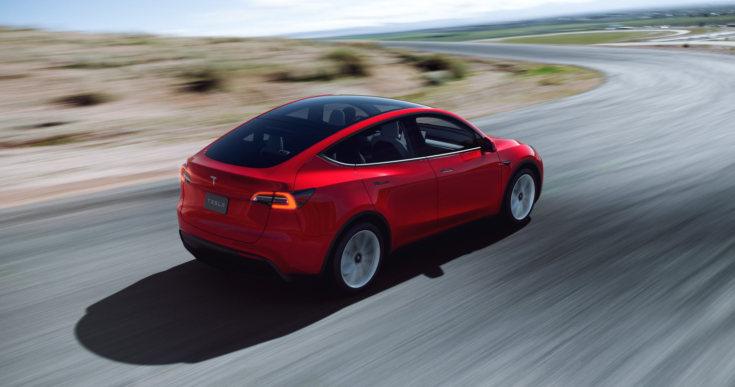
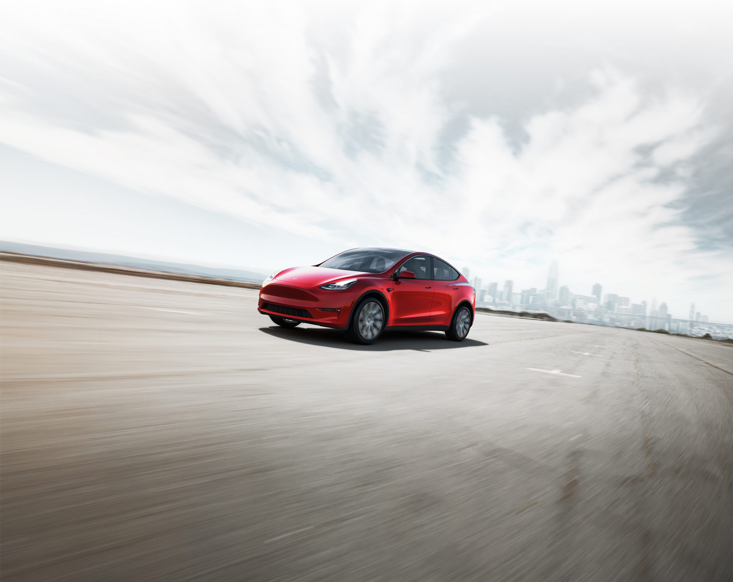
The Tesla Model Y has won U.S. News award for “Best Luxury Electric SUV,” beating out a heavy lineup of worthy battery-powered sport utility vehicles.
The Model Y first was delivered to owners in early 2020 and was the automaker’s answer to the widely-popular crossover SUV sector. A sibling of the first mass-market vehicle the company offered, the Model 3, Tesla’s Model Y has quickly become the company’s best-selling electric car, and that’s saying something considering it is not the most affordable Tesla vehicle and starts at $62,990.
U.S. News recognizes Tesla’s influence in the changing automotive market, identifying that it was likely the catalyst in bringing EVs to mainstream status. Despite the rapid expansion of the EV segment, Tesla has remained at the top of the hill, fending off worthy competitors like Volkswagen, Ford, and General Motors, who have spent decades developing some of the best automotive technology the world has seen. However, Tesla has also managed to stay above tech-focused and savvy automotive startups entering the electric sector, with battery powertrains being their only focus. Rivian and Lucid, two of the most notable names to fit that description, still have not managed to catch up with Tesla.
The Model Y effectively expanded Tesla’s product line to include a new body style. While the Model X has been offered for seven years, the falcon-wing door-equipped SUV is still only produced for sentimental reasons, according to CEO Elon Musk. It also is much more expensive than the Model Y, and starts at $114,990.
Tesla plans to produce Model Ys with both 4680 and 2170 cells at Gigafactory Texas this year
Those who do not quite have the means to spend over $100,000 on an all-electric SUV have plenty of options, but if a consumer is looking for luxury, the Model Y may be the best choice. U.S. News highlights that, while the Model Y does offer less overall cargo and utility room than the Model X, it still boasts many of the same tech features that Tesla has been known to put in its cars. The Model Y has plenty of performance too, and its premier trim level will get you from 0 to 60 MPH in just 3.5 seconds, while still having over 300 miles of range and a 155 MPH top speed.
“Despite the onslaught of new competitors, the Tesla Model Y is one of the most capable and well-rounded luxury electric SUVs that you can buy at the moment,” U.S. News writes. “If you’re in the market, this is an option that’s well-worth a test drive.”
I’d love to hear from you! If you have any comments, concerns, or questions, please email me at joey@teslarati.com. You can also reach me on Twitter @KlenderJoey, or if you have news tips, you can email us at tips@teslarati.com.
The Tesla Model Y has captured Cars.com’s “Best Electric Vehicle of 2022” award, beating out several worthy competitors to be named the best EV of the year.
The Model Y is Tesla’s newest addition to its purchasable fleet of vehicles, and the first all-electric crossover to come out of the Fremont factory in Northern California. Tesla developed the Model Y to be a mass-market vehicle capable of handling a variety of tasks. Not only is the vehicle lightning fast in typical Tesla fashion, but it also packs enough cargo space to give full-sized SUVs something to sweat about. It is truly Tesla’s most well-rounded vehicle, suitable for nearly any lifestyle and at a price point that won’t break the bank.
“Tesla is an electric car innovator, and the Model Y reflects that leadership with its efficiency, charging capability, range, and options,” Cars.com’s synopsis of the Model Y said. “It checks a lot of boxes for consumers who have been considering making the jump to an EV.”
The Tesla Model Y. (Credit: MotorTrend)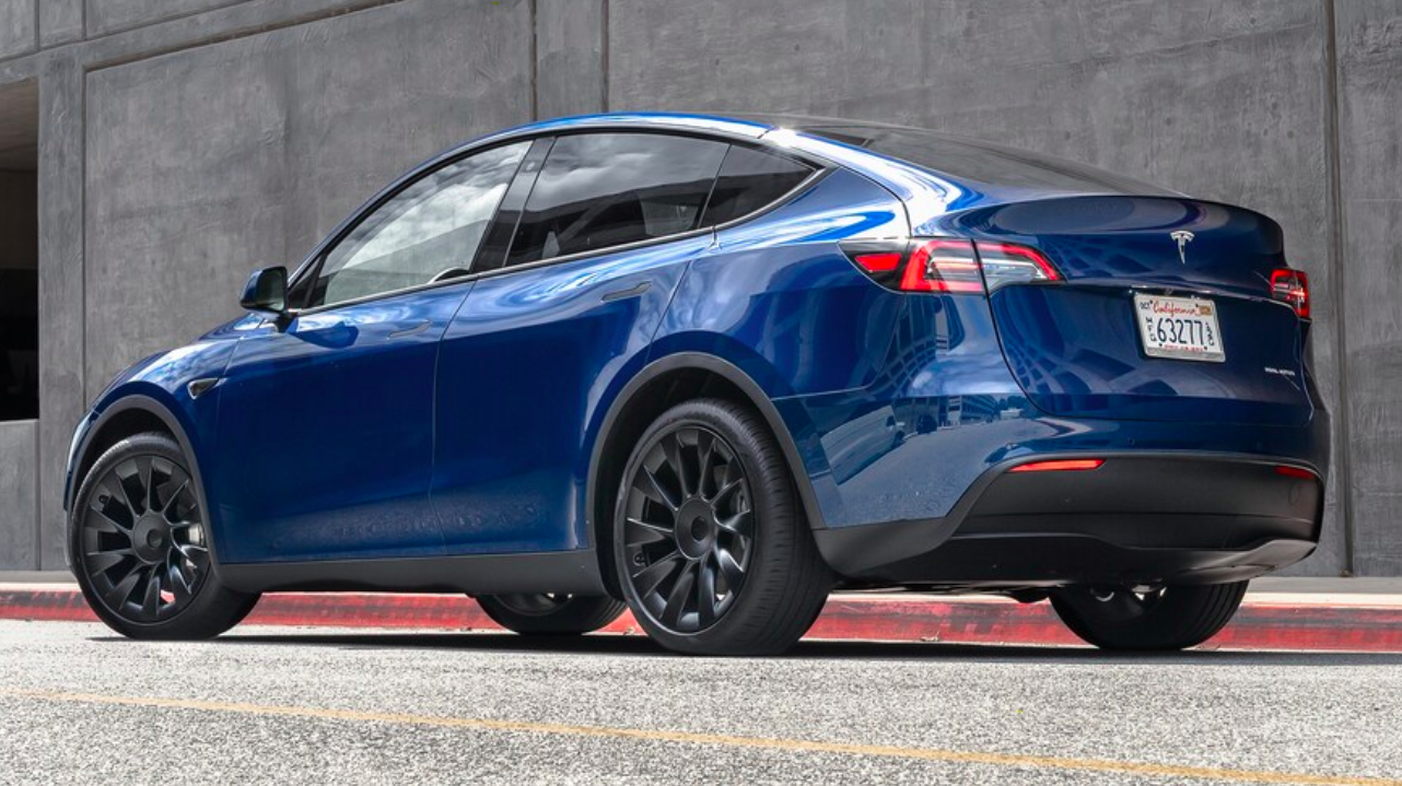
EVs are still a small slice of the overall passenger vehicle market in the United States. While EV adoption is continuing to grow at a fast rate, Cars.com says that about a third of active car shoppers are considering an electric vehicle. Additionally, the site stated that occurrences of searching for an EV on Cars.com have doubled in the past year, while inventory levels of EVs have dropped 30 percent since 2021, showing there is plenty of interest from consumers.
The Model Y may be one of the most appealing options for those who are considering switching to an EV from a gas car. Cars.com notes the Model Y’s incredible efficiency, which is paired with 326 miles of EPA-rated range in the Long Range All-Wheel Drive variant. Not only will the Model Y get you to where you need to go in a minimal number of charging stops, but it also gets better with age. The vehicle, like the rest of Tesla’s fleet, receives Over-the-Air software updates to upgrade vehicle capabilities, fix bugs, or increase performance.
The Model Y is also great for those who have a focus on purchasing cars with a focus on American manufacturing. The vehicle was ranked third on the 2021 American-Made Index, trailing its sibling in the Tesla Model 3 and Ford Mustang.
Cars.com’s list is void of the Lucid Air, Rivian R1T, Hyundai Ioniq 5, and Kia EV6. The publication noted demand and production growth of electric vehicles will allow more models to be considered for the award in the future.
I’d love to hear from you! If you have any comments, concerns, or questions, please email me at joey@teslarati.com. You can also reach me on Twitter @KlenderJoey, or if you have news tips, you can email us at tips@teslarati.com.
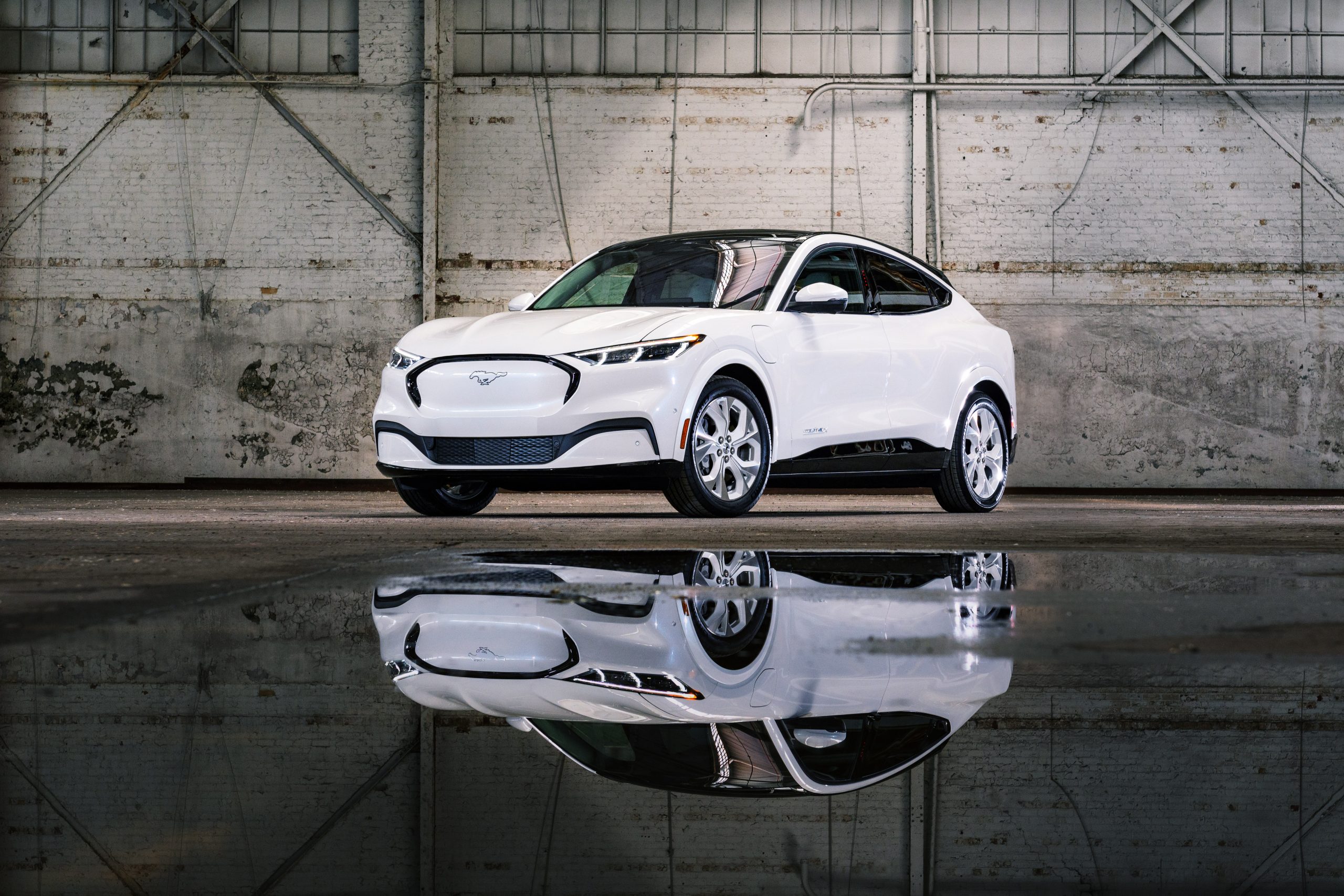
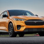
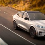
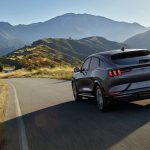
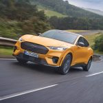
The Ford Mustang Mach-E has won Consumer Reports‘ award for the Electric Vehicle Top Pick. The Mustang Mach-E displaces the Tesla Model 3, which has held the award for the past two years.
CR credits the Mach-E’s rich heritage with the Mustang brand and its obvious popularity based on sales figures to determine the vehicle was in the running for the top pick. After Ford’s introductory EV, the Mustang Mach-E, solidified its prowess in the electric sector by earning the best Overall Score, which factors road-test score, predicted reliability, owner satisfaction, and safety, Consumer Reports had enough evidence to choose it over Tesla’s mass-market EV.
“Make no mistake, the Model 3 is still a great choice, and Consumer Reports recommends it. It shines with the latest technology, a long range, an impressive charging network, and a driving experience closer to a high-performance sports car than a sedan,” CR said. “But the Mustang Mach-E is also very sporty, plus it’s more practical and easier to live with. The Ford is also quieter and rides better. Both cars have large infotainment center screens, but the Mach-E’s is far easier to operate and doesn’t require multiple steps to activate routine features, such as using the defroster or adjusting the mirrors, as with the Tesla. Also, the Mach-E has an edge when it comes to reliability, according to first-year results in our Annual Auto Surveys of CR members.”
The report notes that the Mach-E is more similar to the Model Y than the Model 3, which is a fact. The two vehicles were the one-two punch in the electric crossover SUV sales figures for the U.S. last year, with the Model Y beating the Mach-E.

Consumer Reports also said the Mustang Mach-E gained two additional points to the vehicle’s Overall Score due to the fact it has an active driving assistance system with an adequate driver monitoring system. Any vehicle that has these features gains two additional points. However, CR did not award Tesla Autopilot the two points because the system “can still be used if the driver is looking away or using a phone, as long as there is at least one hand resting on the steering wheel.”
Tesla activated its cabin-facing driver monitoring system in September as part of software update 2021.32.5. Drivers noted that the system worked adequately, alerting drivers following a brief look away from the road to glance at a cell phone or the floor of the vehicle. However, in CR’s in-house study, the publication stated that GM’s SuperCruise did a better job of monitoring drivers during vehicle operation.
Ford has a lot to be proud of as the Mustang Mach-E was its first crack at an EV, and it went pretty well. Mustang Mach-E sales totaled 27,140 vehicles in 2021, according to Ford. While it was not the best-selling EV crossover last year, it was one of the best, and it made a real splash on the passenger market.
I’d love to hear from you! If you have any comments, concerns, or questions, please email me at joey@teslarati.com. You can also reach me on Twitter @KlenderJoey, or if you have news tips, you can email us at tips@teslarati.com.

Tesla gives HW3 owners another massive update

SpaceX Board has set a Mars bonus for Elon Musk


